Microsoft Excel is a spreadsheet editor from Microsoft that allows for viewing, editing, and creation of spreadsheets. The data can be used with the built-in analysis tools, for creating graphs or charts, finding patterns or trends, and more.
To get started, you will want to organize your data. Labeling your rows and columns is a clean and efficient way to get yourself organized. When you click on one of the cells (or boxes) in the document, you can start typing letters or numbers to fill in the cells. To delete information in the cells, highlight the cell and hit the delete key on your key board. If you want to delete the information in multiple cells, you can highlight multiple cells by clicking and dragging your mouse across the page. Depending on what you want to do with your data, you should highlight your data and select a few options from the ‘Quick Analysis Tool’ as described below in this document. Using the quick analysis tool, you can sum or average your data values, or create graphs and charts as well as many other options.
Tell Me
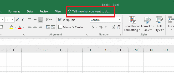
At the top of the navigation menu over to the right, you will notice a little light bulb icon with a search box next to it. This is Microsoft Office’s Tell Me feature, which allows you to search for features in Microsoft Office by typing in certain key words or phrases. For example if you type in “equations” it will give you several options for creating and using equations with your data.
Protected View
![]()
When you download a document from your email or online you might notice you can’t make any changes to it. This is because by default Excel only allows you to view the document for your safety. If you trust where you received the document from you can hit “Enable Editing” to the right of the notification under your Navigation area to be able to edit the document as normal.
Navigation Menu
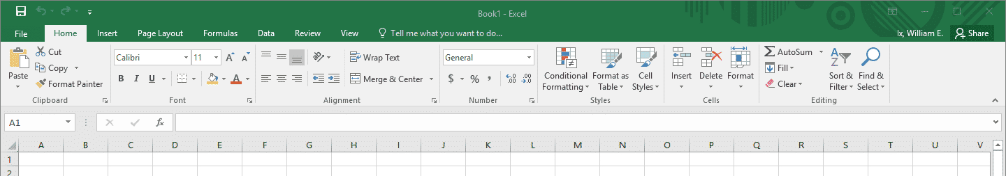
- The “File” tab will bring up a new window where you can save, open, print, and share a spreadsheet. This is also where you can create a spreadsheet.
- The “Home” tab contains basic formatting and aesthetic options to edit your data.
- The “Insert” tab allows you to place different graphs, charts, and symbols into your data sheet
- The “Page Layout” tab contains specific and advanced formatting options.
- The “Formulas” tab gives you the option to create your own formulas to be used along with your data.
- The “Data” tab can be used to group your data in a specific way and analyze it meaningfully without graphs.
- The “Review” tab has options to help self-evaluate and check the information in your data sheet.
- The “View” tab has options that make your graph easier to see and work with.
Quick Access Toolbar
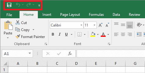
The quick access toolbar allows you to quickly access tools and functions that you might need or want commonly.
- The “Save” button allows you to quickly save without having to go through the file tab. If you have not yet saved your document this will act as “Save As”, asking where you would like to save it and what you would like to name it. Shortcut: Ctrl + S on Windows and + S on Mac.
- The “Undo” button allows you to undo the last change you made to your document. This will allow you to undo any changes you’ve made this session. The arrow down next to it will allow you to select a specific change and it will undo everything from that point on. Alternatively you can hold down the shortcut to undo until release. Shortcut: Ctrl + Z on Windows and + Z on Mac.
- The “Repeat” button allows you to do a couple different things. It is commonly used to redo an action you might have accidentally undone or it can also repeat the last thing you did such as inserting a table. Holding down the shortcut will use this function multiple times. Shortcut: Ctrl + Y on Windows and + Y on Mac.
- The last button on the Quick Access Toolbar is a dropdown menu which features common windows functions such as save and spell check. This can be customized to include features you commonly use so you don’t have to memorize shortcuts or switch tabs every time you wish to do something.
Quick Analysis Tool
The quick analysis tool saves you time by performing different 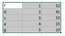 operations on your data. Once you have all of your data set up, you’ll want to highlight all of the cells that you want to add, sum, make a graph of, and many other options by clicking and dragging the mouse over the cells. In this example, we will highlight all of our values, but you can as few or many rows, columns, or cells as you want.
![]() After your data is highlighted, this icon will pop up at the bottom right corner of the highlight window. Click on it to bring up the options window.
After your data is highlighted, this icon will pop up at the bottom right corner of the highlight window. Click on it to bring up the options window.
The formatting, charts, totals, tables, and ‘Sparklines’ options all give 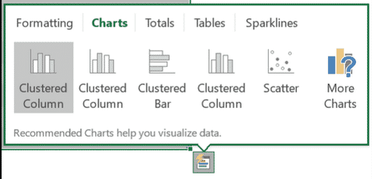 you different tools to manage your data. The ‘charts’ sections gives you different graphing options as shown in the picture.
Recommended Charts
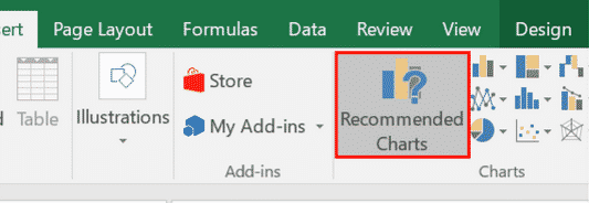
Excel has new types of charts that can be found in the insert tab at the top of the screen. If you want to use any of the old styles of graphing from excel, you can find them in the ‘All Charts’ tab from the ‘Recommended Charts’ pop up window.
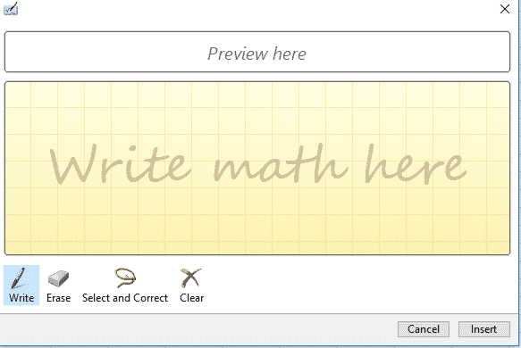
Ink Equations
Another cool new feature called Ink Equations allows you to convert 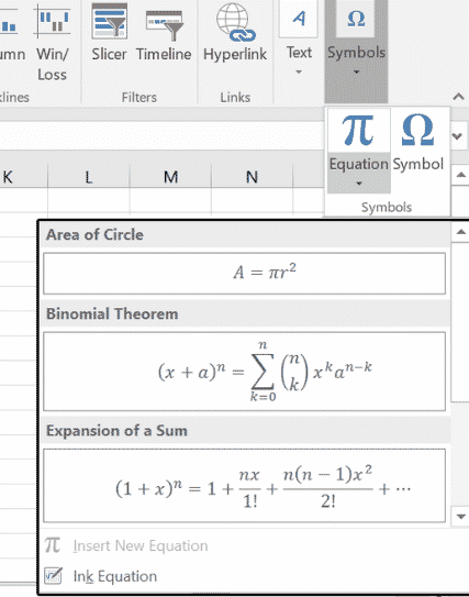
your hand written equations into an equation that excel can use for your data. Simply click the ‘Insert’ tab and then the ‘Symbols’ option. At the bottom of the drop down menu there will be the “Ink Equation” option, click on it to open the writing window. This new window (on the right) will allow you to draw up an equation using your mouse. This is especially handy when your equation might be easier to draw then to type.